
CineMap
UX Research and Design

Overview
CineMap is a movie browsing app I designed that focuses on trailer consumption and streamlining the movie selection process for entertainment consumers, filtering through movies in theaters and on subscribed streaming platforms to make movie selection more convenient.
Problem:
It’s hard to decide on a movie to watch. People don’t want to waste time or money on a movie they end up not enjoying.
Goal:
Present trailers of movies that align with users' own interests on a mobile app so people can easily find movies they will enjoy.
My Role:
UX Researcher and UX Designer from idea conception to mockup delivery
My responsibilities: conducting user interviews, persona creation, user journey mapping, usability testing, storyboarding, wireframe design, lo-fi and hi-fi prototyping
User Interviews
I started the discovery and brainstorming research process by conducting user interviews. I conducted these individual sessions to collect qualitative info and empathize with the user base by addressing user needs, behavior, and motivations to guide the future design of my app.
Sessions averaged 30 minutes long and were conducted remotely via phone calls. Consent was received for recording for transcription and note-taking.
Participants
-
4 total: 2 men and 2 women
-
Ages 18 - 40
-
All US Residents
-
Recruited through personal network via social media posts and texts
-
Screened for frequent movie viewership defined as at least one movie watched per month
Research Goals
When and why people watch trailers for movies
What people look for when picking a movie
What makes people excited about a movie
What factors push people over the excitement threshold to decide to play a movie
Overall movie browsing experience: user behavior and emotions during the step-by-step process
Interview Insights
Options Overload
The number of available movies available to watch at a given time is considered overwhelming and intimidating to users. There is a need for option removal so users feel comfortable browsing without being overwhelmed by sheer amount.
Time Consuming
Lots of titles to browse through takes time. Long browsing sessions without successful selection increases frustration and often amounts to the process ending without picking a movie. This highlights a need for filtering of unwanted options to shorten browsing time.
Activation Barrier
Users who come across trailers already playing often find them appealing and promote excitement. But users don’t usually opt in to watching trailers. This emphasizes the importance of trailers for consumer interest and the need for low activation energy to access them.
Distrust in Unfamiliarity
Users see reliability in familiar features of movies and it takes little convincing to watch them. But convincing users to watch an unfamiliar movie requires heavy persuasion to prove entertainment value. Promoting movies can garner more interest by highlighting movies to users based on familiar likes.
Accessibility Preference
The originally plan for the app was to show trailers for movies exclusively shown in theaters but trailers for upcoming movies were pretty accessible for users due to commercials and the limited number of movies in theaters at one time. There was a bigger pain point for users browsing movies to watch at home. Due to the pandemic and a lower willingness to venture to movie theaters, I expanded the app design to include movies accessible online through streaming platforms as well as those playing in theaters.
Personas
I created personas based on the patterns found in the user research interviews to identify user groups and humanize the user experience. I used these personas to develop problem statements and guide the product design process.
Compile interview transcripts and notes

Organize qualitative data by grouping into themes

Group related themes into two distinct psychological profiles based on key motivations and frustrations
Indecisive but Open-Minded
-
Loves a sure thing but is willing to take a risk
-
Indecisive and stressed about the overload of options
-
Will use trends, acclaim, genre, group interests to pick a movie and narrow down options
-
Loves watching previews in the theater, likes the process of browsing trailers to find good movies and weed out bad ones
-
Likes a variety of movies based on situation: watches sad movies alone but watches funny movies with friends
Loyal Fan
-
Trusts in what they know
-
Rewatches favorite movies, follows installments of movie series and their favorite actors
-
Favorite movies fall into similar genres
-
Doesn't like the risk of browsing for new movies that could potentially be bad or boring
-
Doesn't want to waste time or resources by browsing for a long time to pick a movie, but is easily piqued and persuaded by an interesting trailer
Personify user profiles
.png)
I iterated on the key motivations and frustrations developed in the prior draft of the personas to humanize the user groups further and provide a way to empathize with these hypothetical people when working out design conflicts deeper into the design process.
User Journey Mapping
Motivations
-
The goal was to empathize with my users' needs on a step-by-step level
-
Developed the map through the perspective of "Melanie", the indecisive persona
Conclusions
-
Exposed that there are many time-consuming steps of reflection and research involved in a spontaneous decision to watch a movie, leading to user frustration
-
Helped identify pain points not explicitly expressed in user interviews, ex: sifting through many websites during the search process
-
Discovered actionable insights in the form of features I could implement into the new app, ex: offering suggestions only from platforms the user subscribes to & pinning movies of interest.

Competitive Analysis
Leading to the design of the product, I conducted a competitive analysis to show where my app fits in the market and where it can stand out. I researched movie ticketing products (Fandango, Flixster, AMC) and streaming apps (Hulu, Netflix) as well as Movies Box, a direct competitor that prioritizes trailer play and movie downloads.

I conducted a feature analysis to identify what's been done before and where my app can stand out. I focused on features that could narrow down movie suggestions, like keyword search and filtering, the ability to save for later, and personalization. Since interviews showed that users respond well to trailers when they are shown, not sought out, I examined how apps made trailers easily discoverable.

Based on the feature analysis, I identified opportunities to fill gaps in the market as:
-
a detailed filtering algorithm
-
recommendations of upcoming movies based on activity
-
recommendations for movies across platforms - in theaters and on subscription services - to streamline consideration of all accessible content in one place
These features were key considerations moving forward into the app design phase.

Wireframes
I began the UX design for CineMap with low fidelity wireframes and a prototype made on Figma based on the feedback and findings from the user research I conducted to test out user ideas into fruition.

Usability Testing
Participants
-
5 total: 2 men and 3 women
-
Ages 18 - 30
-
All US Residents
-
Recruited via social media posts, texts, and Coursera class board
-
Participants screened via survey identifying themselves as frequent movie viewers (at least 1/month)
Research Goals
-
What path do users follow to find movie information?
-
What are users' reactions and opinions on the search & filter feature?
-
What areas on the app produce confusion?
Session Details
-
Unmoderated, remote via UserZoom
-
4 interactive tasks + follow up questions
-
User interaction with lo-fi prototype on Figma
-
10 minute average length of session
Usability Insights
Identifying Themes With Affinity Diagrams
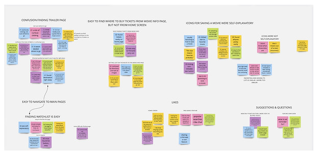
I reorganized every observation from the qualitative data collected from the usability test sessions into an affinity map where I placed similar observations together into groups and subgroups.
From Observable Themes To Actionable Insights
I used the themes found from affinity diagramming and turned them into insights to update my designs. These insights were used to iterate on the low fidelity designs and create updated high fidelity mockups.
Navigation Cues
Users need visual cues for current location within the app and context for each page.
Differentiate Icons
The “Add to Watchlist” icon and Star icon have too similar functions. These buttons should have unique, non-overlapping functions to limit user confusion.
Directions To Scroll
The trailer page needs instructions to prompt users to scroll down to view more trailers.
The patterns found by affinity mapping helped me understand what parts of the app were understood by users and were user-friendly, those that were confusing, as well as likes, constructive design suggestions, and questions.
Making Lo-Fi Design Iterations

Navigation Cues
“It didn’t say ‘Watch Trailers’ so that was confusing. The page was easy to find I just didn’t know I found it.” (Participant 1)
Design Updates:
-
Added Titles to each main page
-
Made the icon for the Trailer Page more associative of a movie trailer with a film border around the play triangle.
High Fidelity Mockups
 |  |  |  |  |  |
|---|